Hello, Goodbye
My family's exciting new chapter and bittersweet farewell

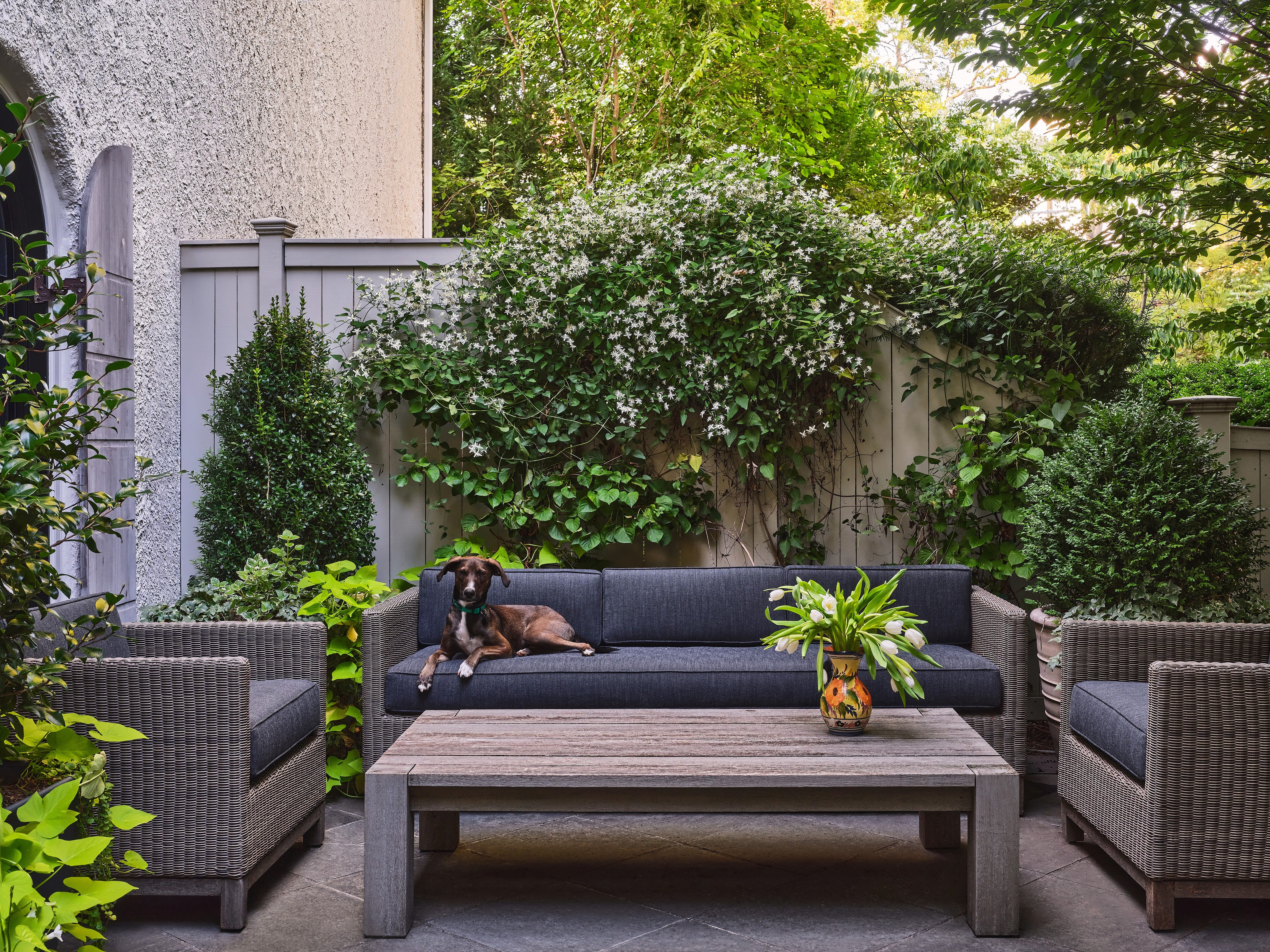
Last month, I moved out of my first real house. And by “real,” I mean the first home I designed (almost) from scratch. I had a budget to work with, a vision, and the kind of clarity and chaos that only comes from designing for yourself. It took six years. I poured my heart into every inch of that space. I made a million mistakes and second-guessed my choices constantly, but in the end…it sang.
So consider this my love letter: to the house that raised my girls, became my creative lab, and (for the first time?) made me feel fully at home and inspired. As I say goodbye, I’m leaving you with the thing that made that house feel alive: the color. The shades that made it warm, made it surprising, made it personal—made it me.
We’re headed into a big new chapter: a year in a rental while we rebuild a nearly 100-year-old French manor-style home we just bought. It’s as dreamy and daunting as it sounds. And the most exciting part? I’m bringing you all with me. Every design decision and hiccup will be shared right here, including the hows, the whys, the lessons, and hopefully a few I-need-to-try-that moments for you.
I’m delighted to have you along for the ride. Let’s do this.
All of the Paint Colors in My House
Cabbage White
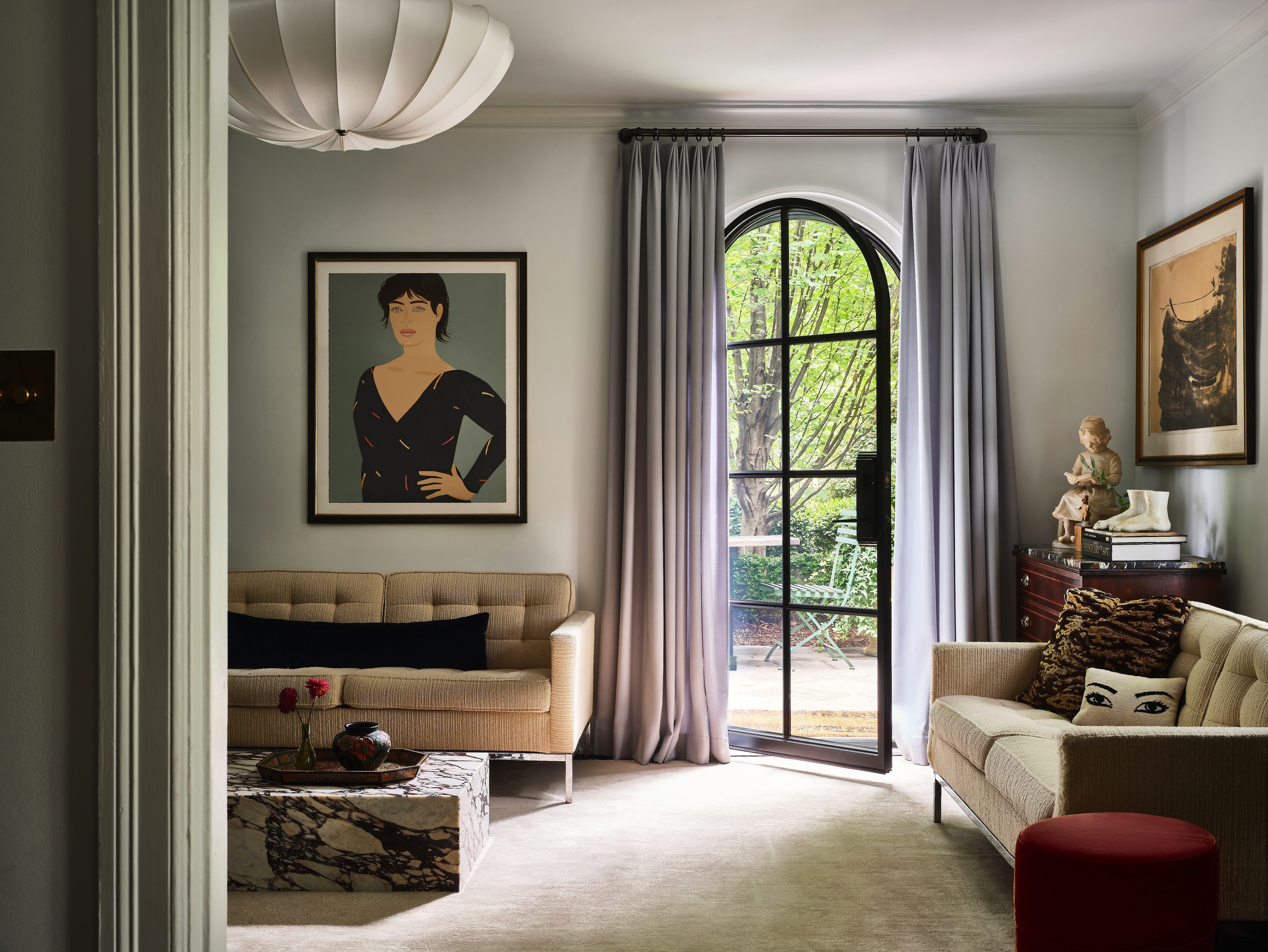
I love a barely blue—it’s ethereal and brightens up even the darkest spaces. There are so many shades of white out there, but this one has a blue base, not a red or green one. I wanted a color-drenched effect, but without any harsh contrast. Cabbage White runs through the entryway and throughout the home. It works so well with the warm furniture and rug, creating a seamless flow.
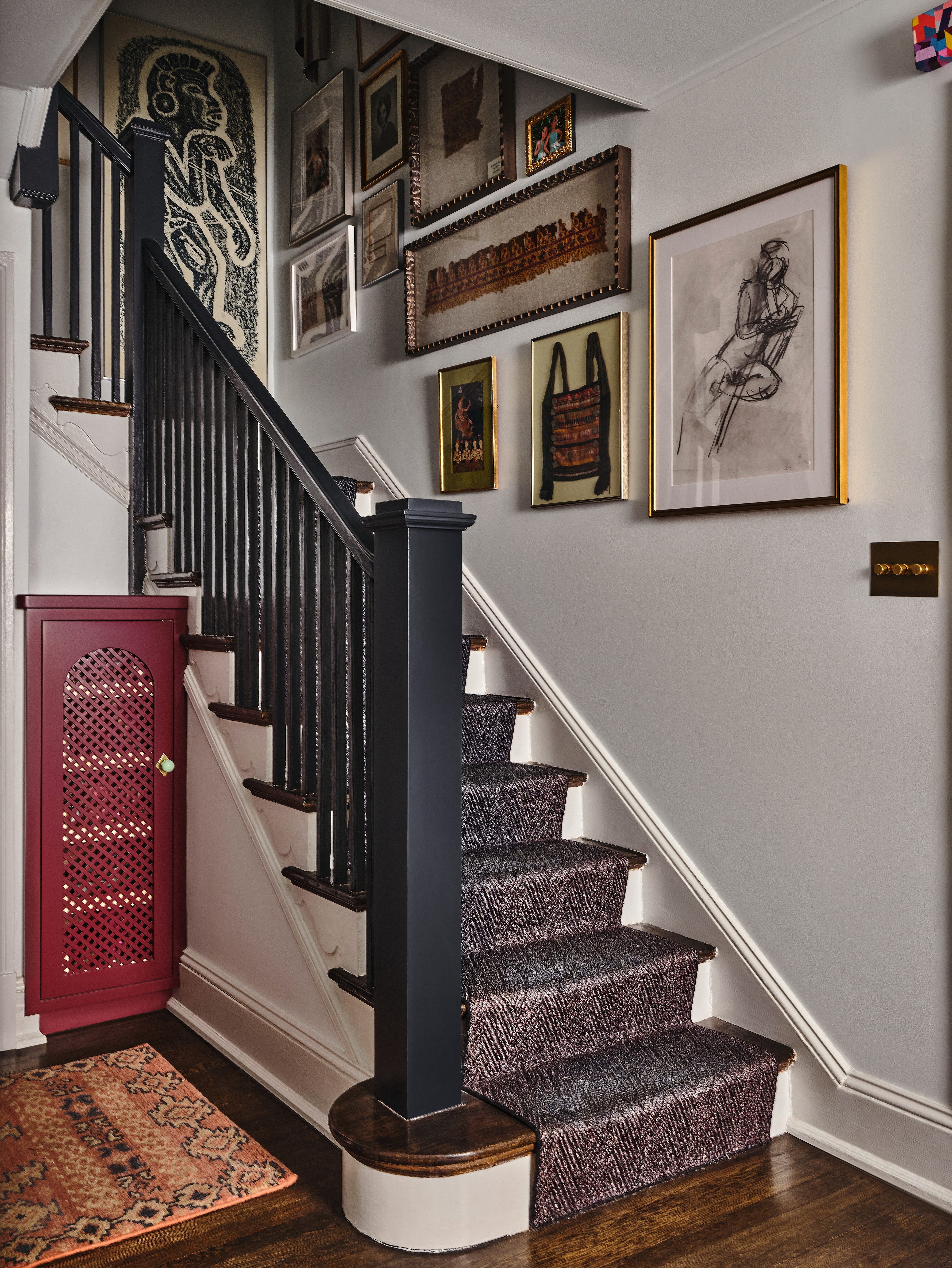
Preference Red
I painted the built-ins in Preference Red, and it made a bold statement, especially when paired with the entry millwork as a thread that ties everything together. It adds a little funk to an otherwise serious wallpaper, grounding the ornamental design. In the kitchen, we kept the trim in Oxford Stone, which fully drenched the cabinets. The space is compact, so transitioning colors delicately was key—it creates a harmonious thread that runs through the rooms.
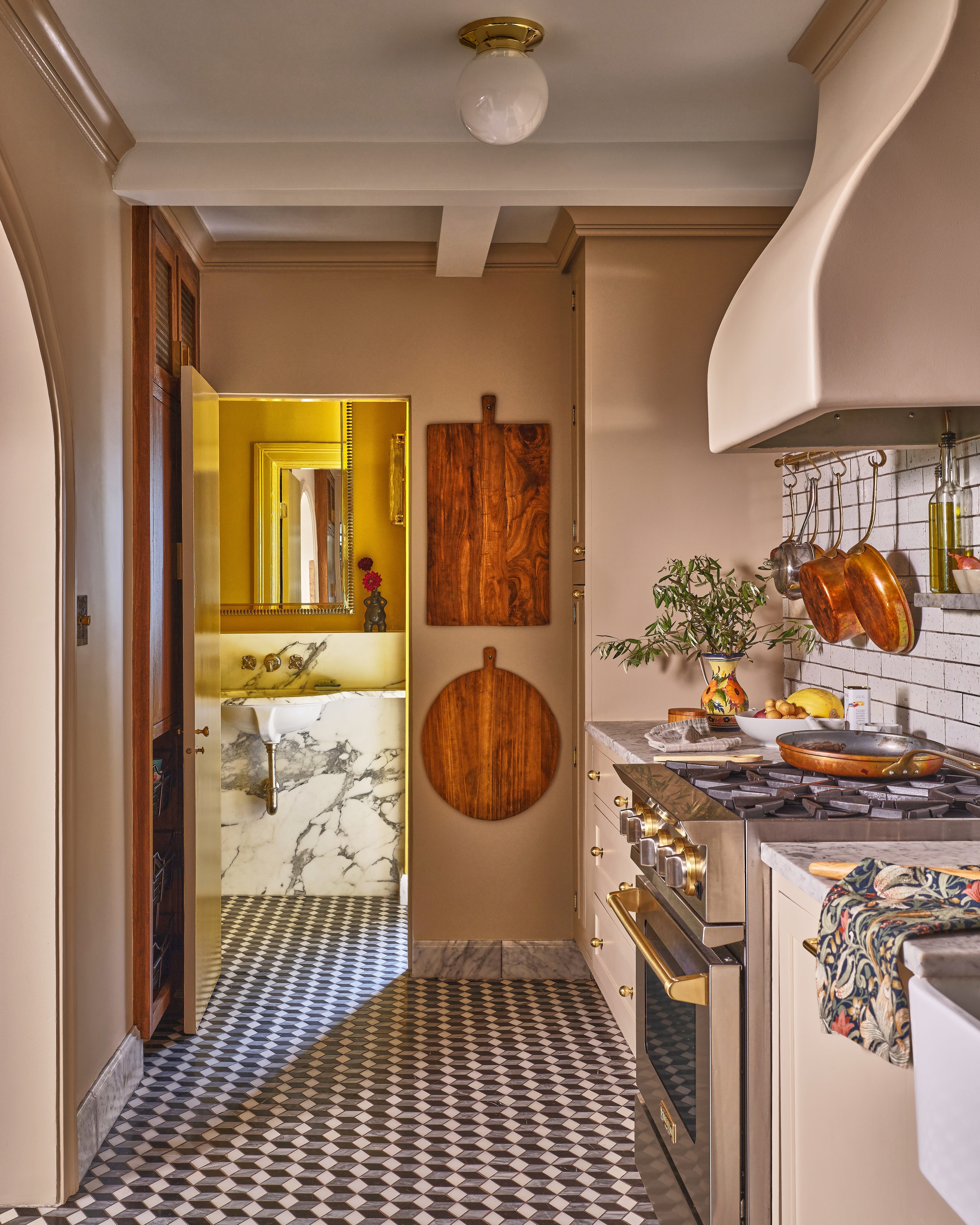
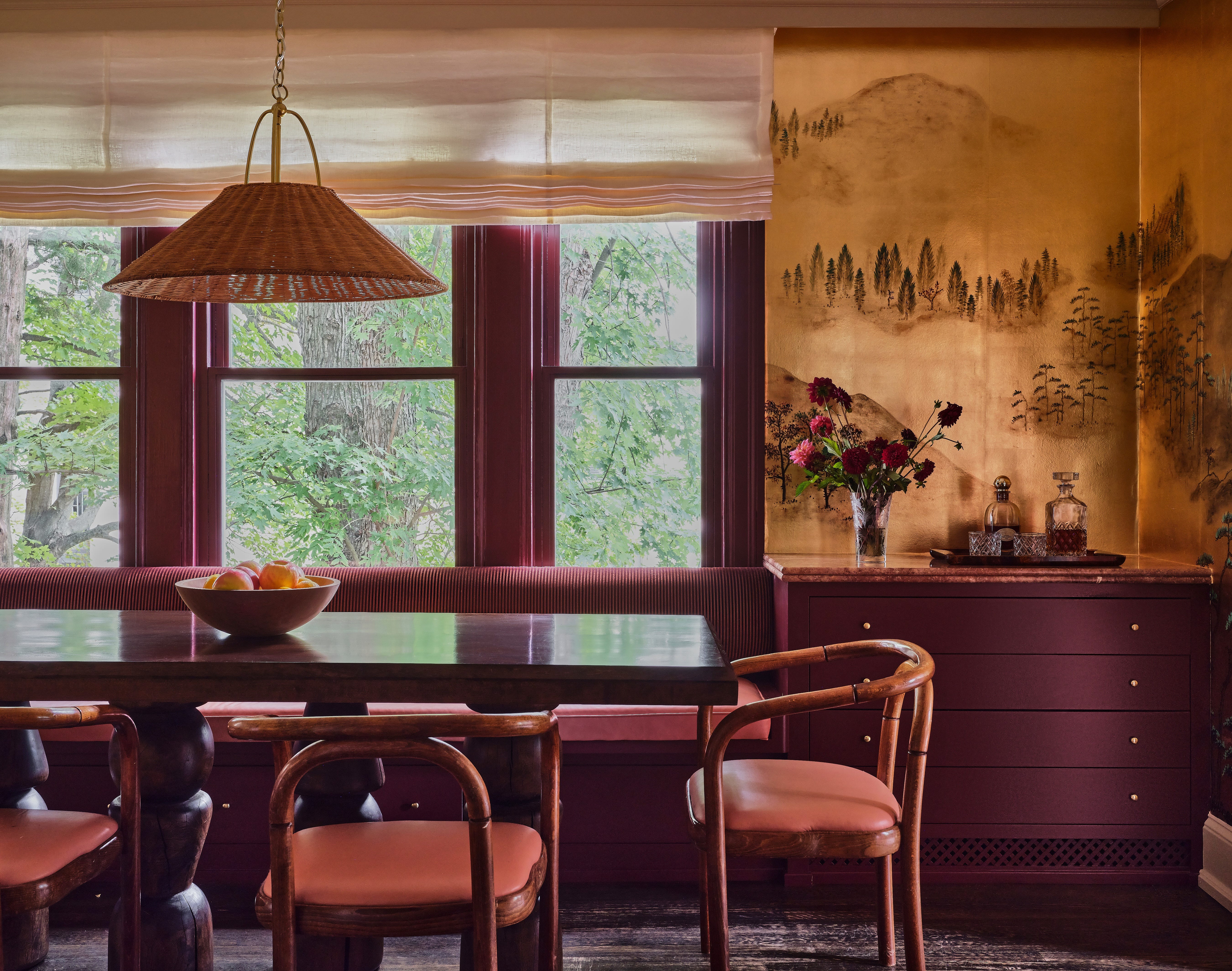
Oxford Stone
This room doesn’t have much natural light, so I opted for a red undertone to complement the red in the dining room. It’s inspired by the Cotswolds—earthy, glowy, and warm. I didn’t want the color to compete with the graphic floor, so Oxford Stone is the perfect neutral balance. It's one of my favorite putty tones: not quite pink, but still with presence.
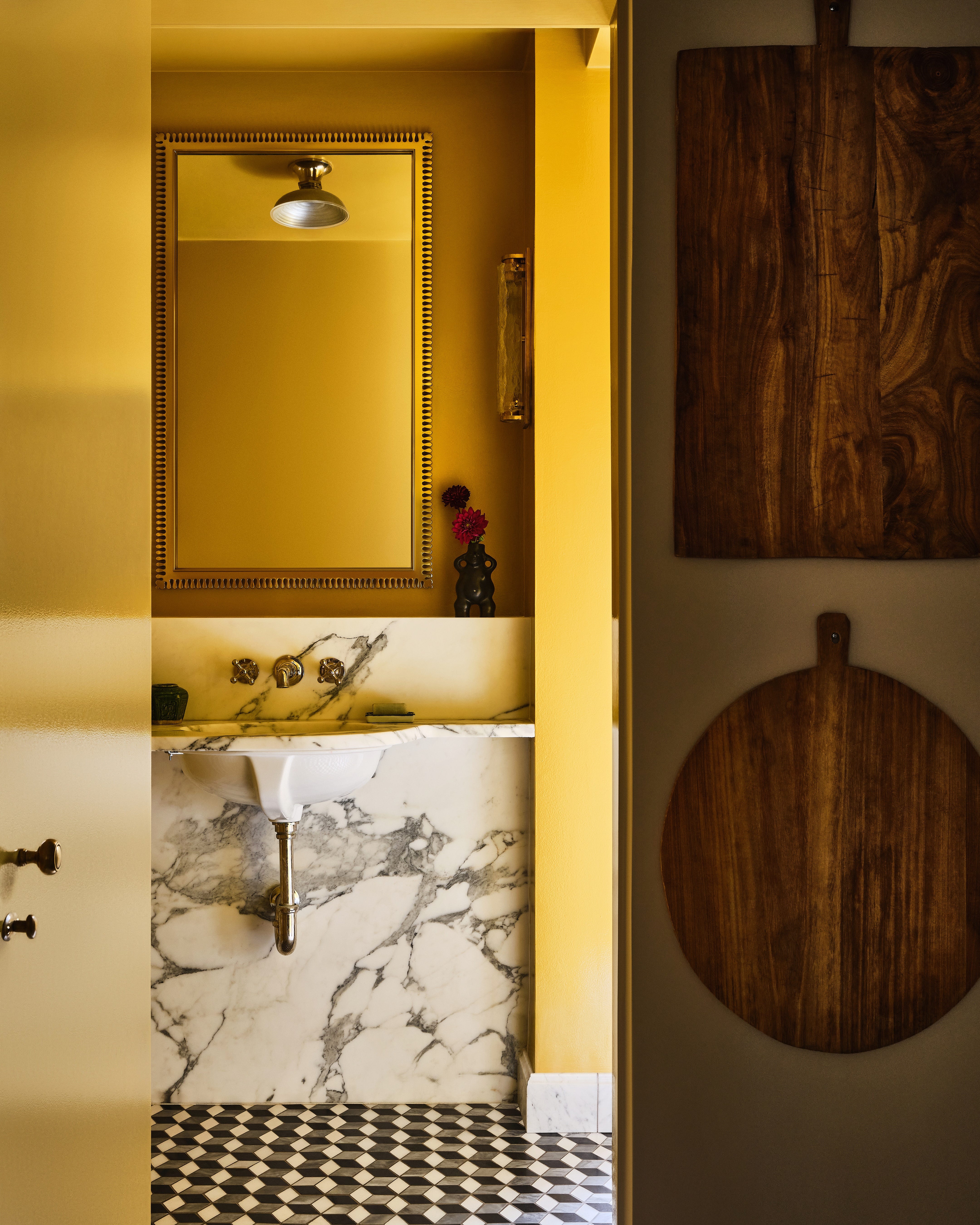
India Yellow
I saw this color in a powder room once and instantly fell in love. It’s the only room in the house where we used high-gloss, and I wanted it to be bright and lively, almost like saffron. India Yellow is ideal for rooms with intensity, ones you only experience for a short time—like a powder room. Plus, it casts a flattering, olive tone on everyone who steps inside.
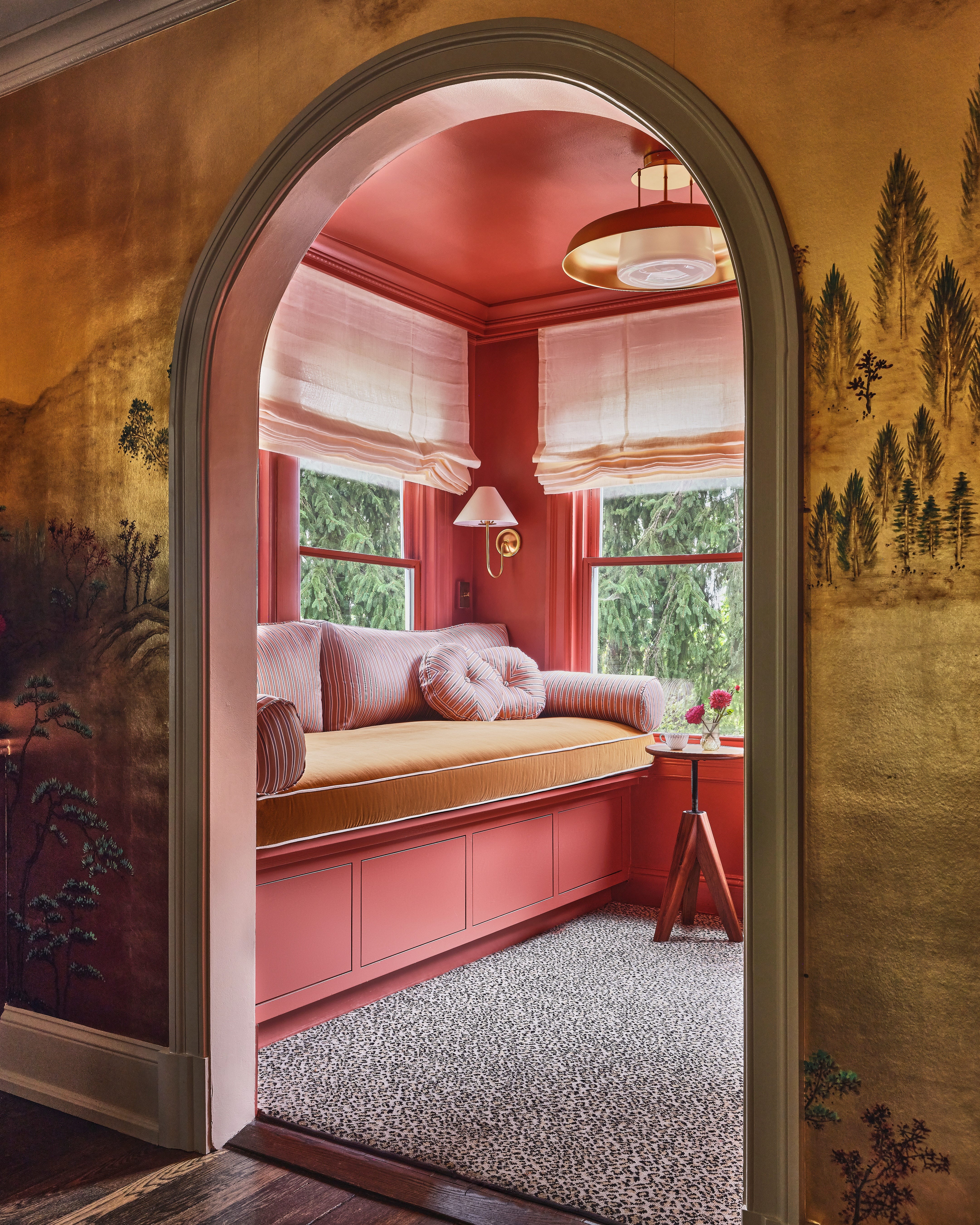
Book Room Red
I’m currently in a terracotta moment. I found the perfect spot for it here, especially with the red bases in Preference Red and Oxford Stone. The different values of these similar colors create a perfect “color-drenched” snug. The muddy terracotta adds to the rich warmth of the space without overwhelming it.
Parma Gray
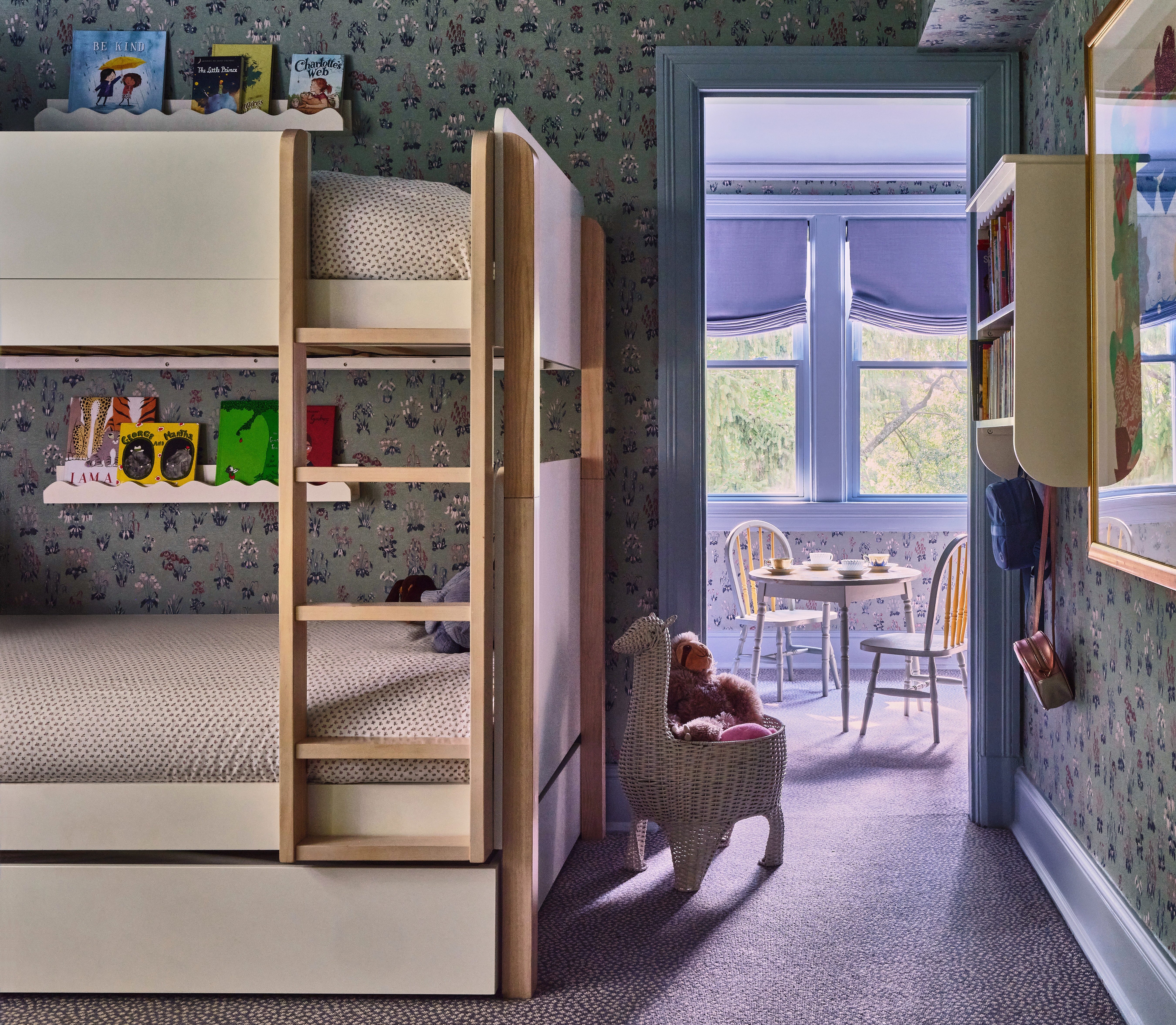
For my daughters’ room and playroom, I wanted a fresh, cool blue. It’s on the second story, with lots of windows letting in natural light, which makes this color feel crisp and airy. Before, the room had darker wallpaper, but I was craving a lighter, fresher vibe. Parma Gray was the perfect fit.
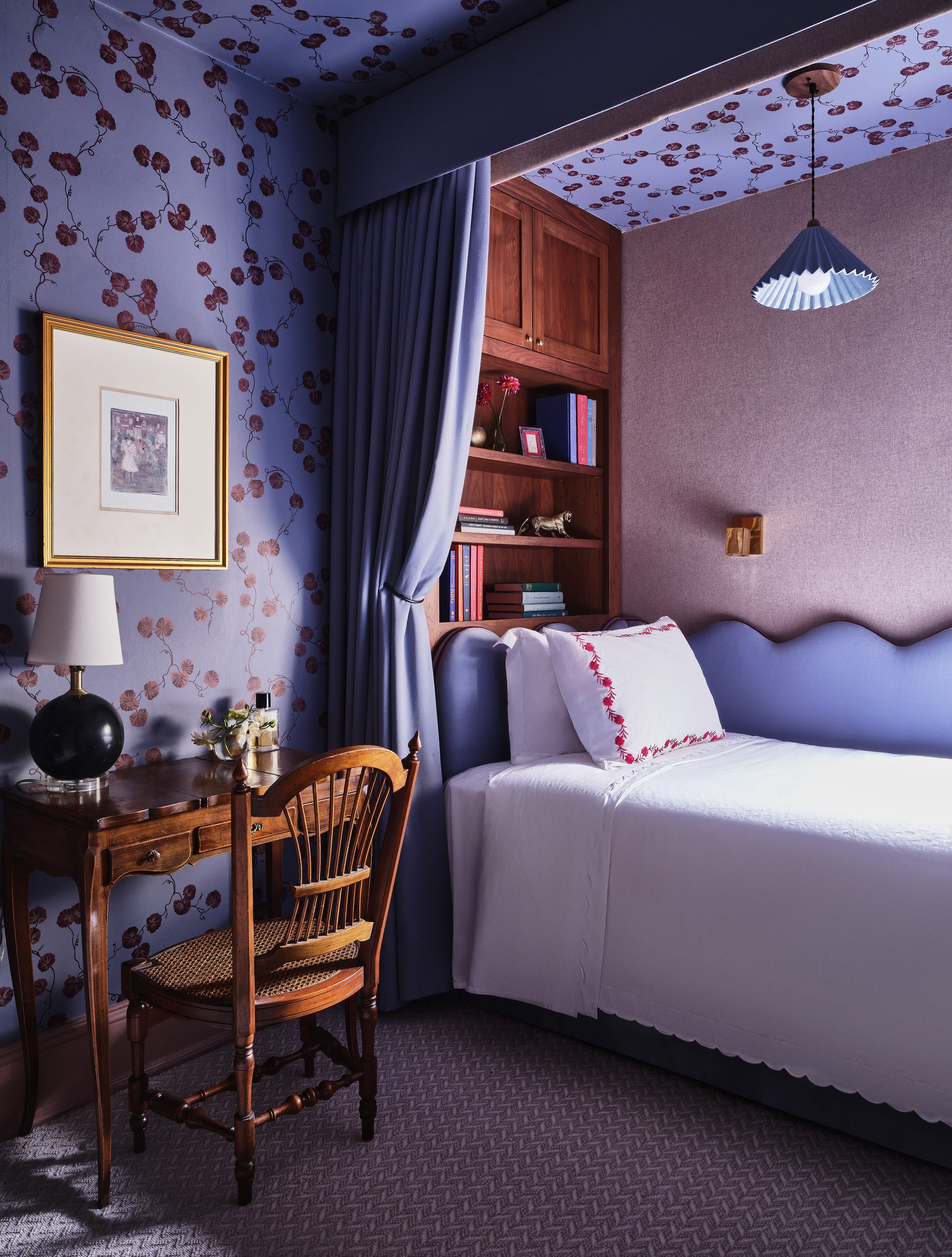
Sulking Room Pink
The guest room is my boudoir moment. It’s not an overtly pink space, but rather a chalky, sexy pink that gives the room a feminine, jewel-box feel. The contrast of the blue wallpaper against the trim feels unexpected, but in the best way. It’s a small room, so it needed to feel cozy yet luxurious.
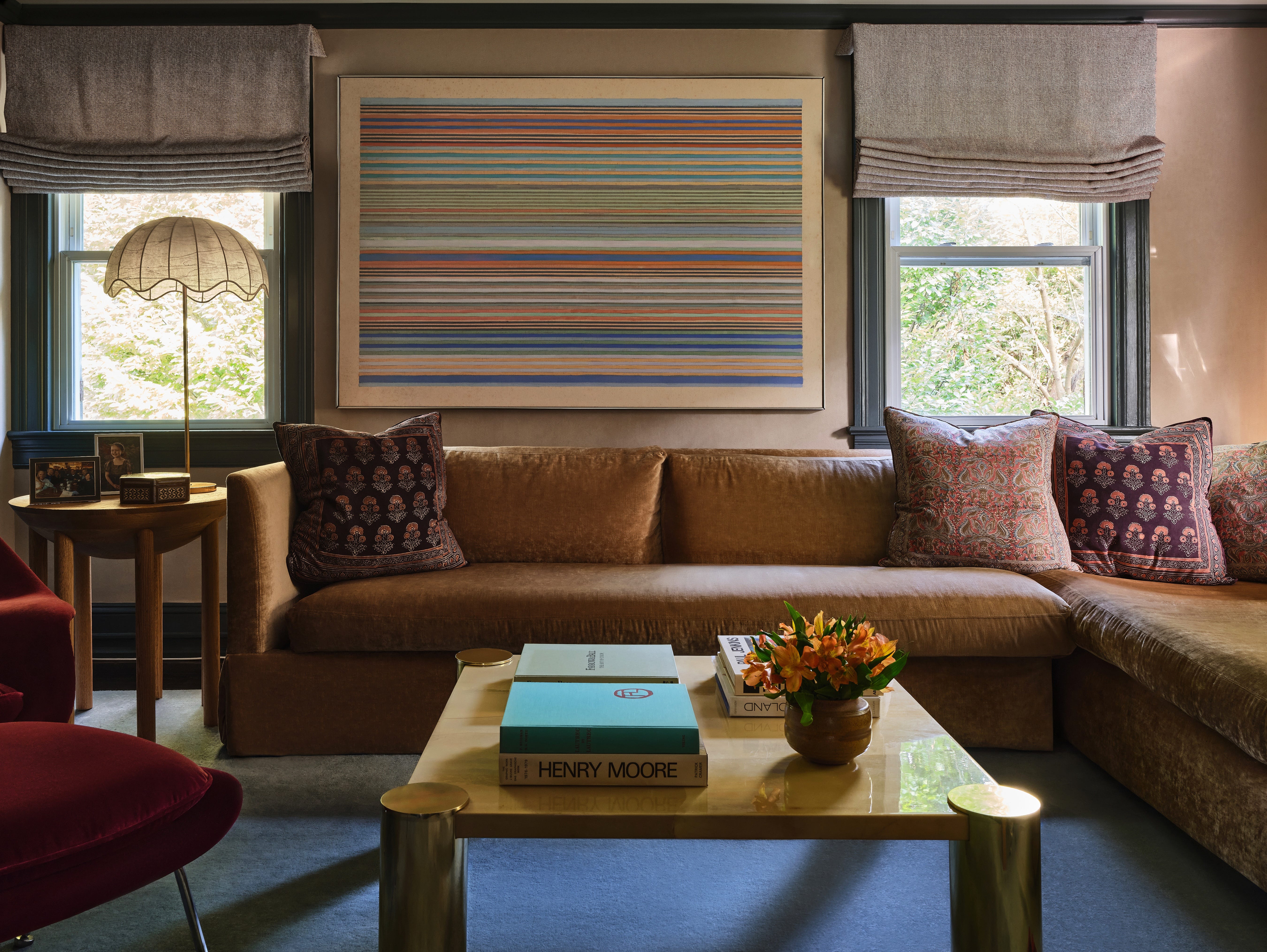
Studio Green
This room needed to feel a bit more handsome. The walls and sofa are similar in color, so I chose a green-black trim to create a sharp graphic contrast without it being too harsh like black or gray. Studio Green adds just the right amount of depth to the space, making it feel strong but still inviting.
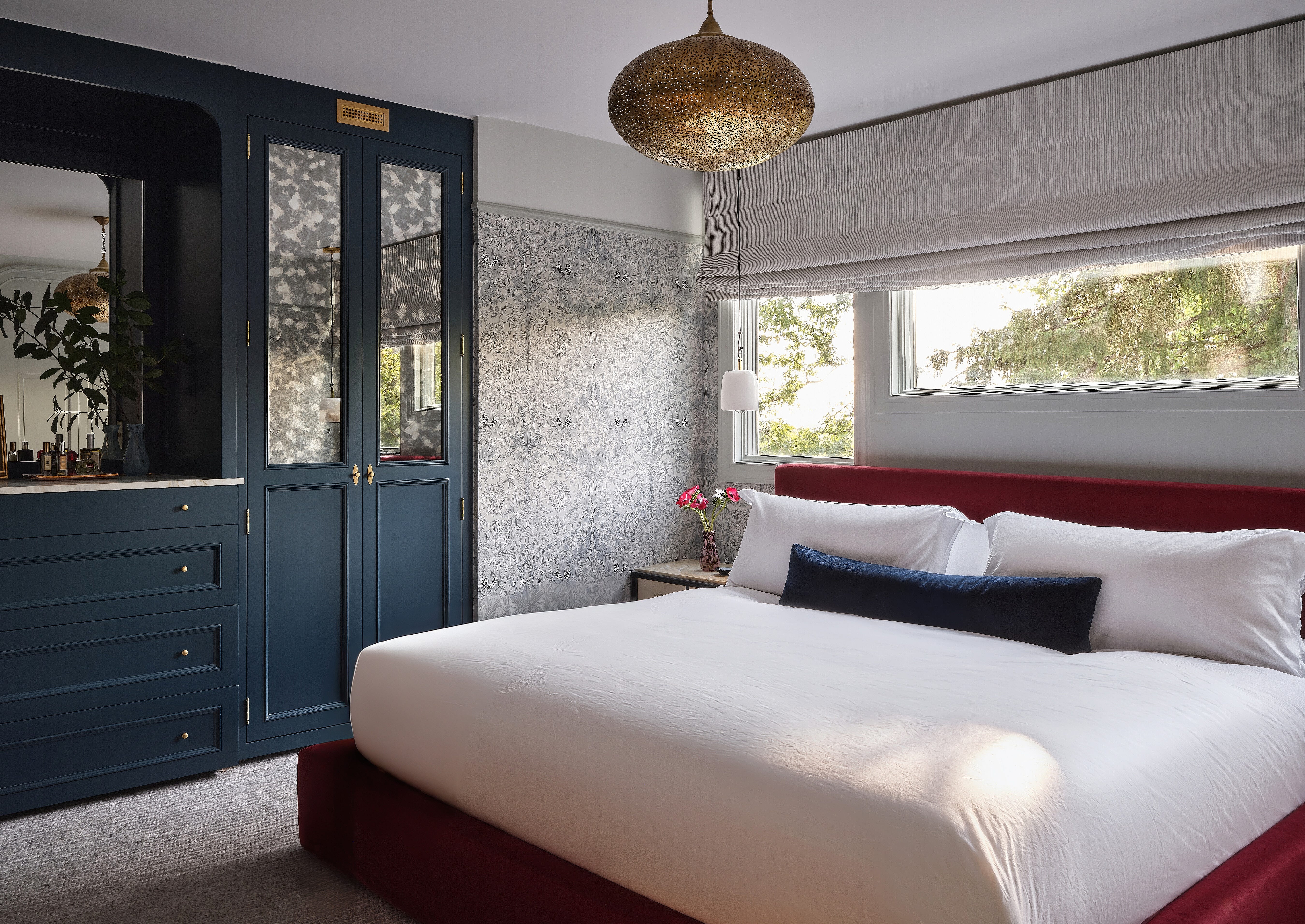
Hague Blue
In the bedroom, I wanted the built-ins to stand out from the trim, while keeping the overall feel of the room ethereal. Hague Blue was perfect for this—it’s a rich, deep color that doesn’t shift the mood too much. Plus, it complements the William Morris wallpaper in the skylight, drawing from the field colors and tying everything together beautifully.