

3 Aesthetic Obsessions Shaping Kemble Cottage
From ’80s chintz and lacquered rooms to historic architecture and globally collected layers

I’ve spent a lot of time talking about the process of Kemble Cottage—the decisions, the lessons, the problem-solving, the very real logistics of making a house actually work for real people. And while that part matters, I’ve realized I haven’t talked nearly enough about the pretty part.
I gave you a kind of paint-by-numbers color story, but now I want to zoom out and talk about the bigger inspiration behind it all. The part that shows up on Instagram. The part that sends you back to Pinterest again and again. The things we save with the best intentions…and rarely return to.
This Sidenote is for those saved folders.
Lately, I’ve realized that instead of walking through this house room by room, it makes more sense to talk about what’s actually driving it—the ideas I keep circling, no matter the space. When I step back, there are really three things shaping this house aesthetically, and everything else seems to orbit around them.

First: an old-school ’80s sensibility
I think I’m having a bit of a moment with it. I got my start at Mark Hampton, and while I wasn’t actually working there in the ’80s—I was at home playing interior designer with my Barbies—when I arrived, chintz was still very much in the conversation. Rooms were layered, tailored yet comfortable, and unapologetic. Pattern wasn’t ironic, it was confident.
That spirit is finding its way back in, but in a quieter way. I’m thinking Bridgewater sofas and chairs—overstuffed, down-filled, skirted—upholstered in linen, glazed linen, or even full chintz. In some rooms, I love the idea of going all in: pattern on the walls, pattern on the upholstery, letting the room feel immersive and nostalgic. In others, it’s more of a peppering—a heavy chintz moment on a Billy Baldwin slipper chair in the bath, for example, or a single upholstered piece that supports the design story without overwhelming the space.


I’m also not ruling out some of the era’s more indulgent tendencies. A lacquered room somewhere feels tempting. And definitely a hint of leopard. The goal isn’t costume; it’s softness with confidence. Nostalgia, refined. I envision traditional shapes grounded by modern art—Katz, Hockney—so everything feels current, not precious.
Think restraint with a wink. And yes, I’ve asked myself the obvious question: Is Dynasty too over the top?
Second: historic architecture that’s allowed to evolve
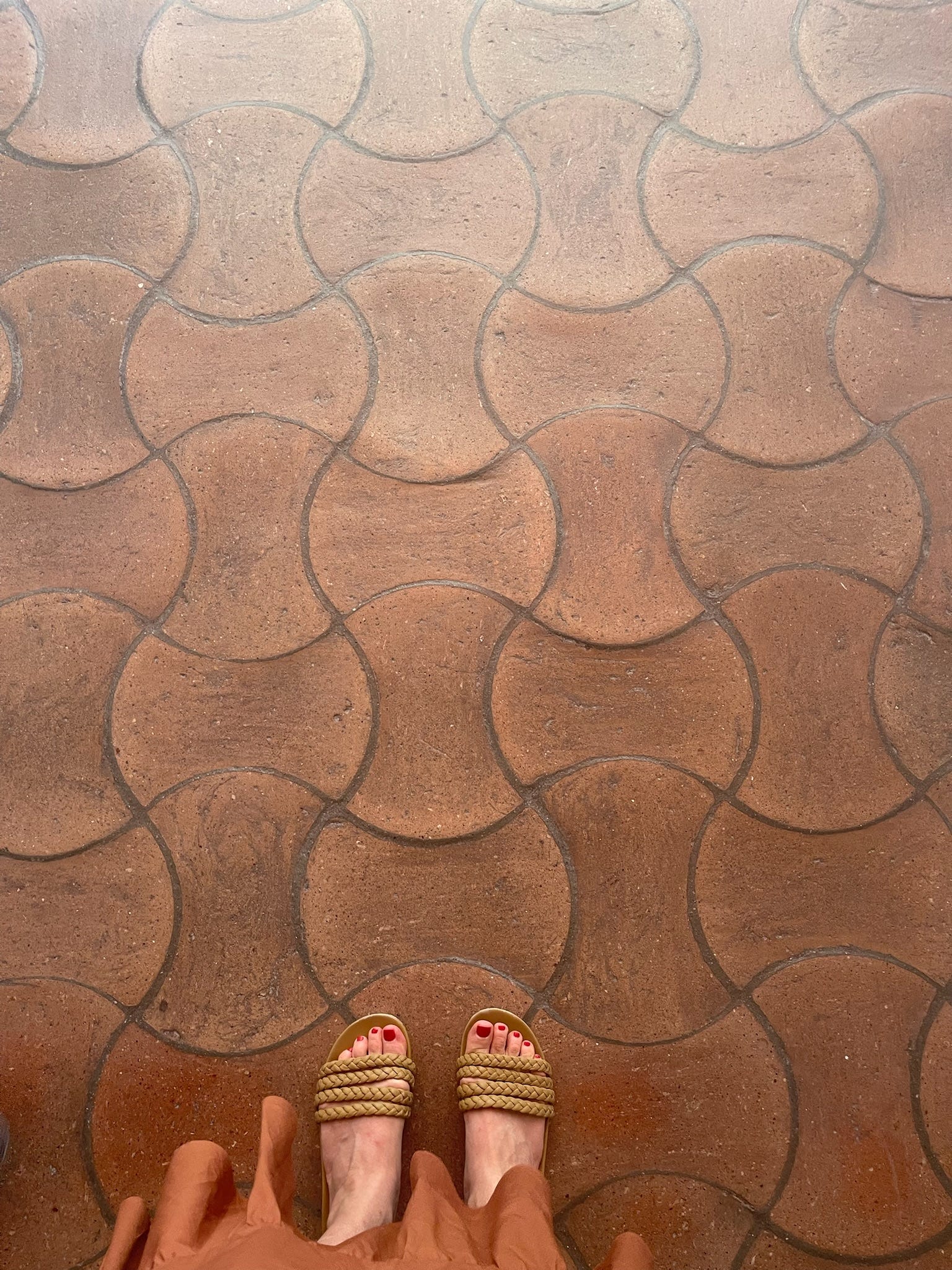
The house is nearly 100 years old and already carries that lived-in Cotswolds-meets-Provence soul. We’re leaning into it, but not freezing it in time. I firmly believe a house should honor its history without being trapped by it.
This is also very much an outside-facing house. The views are strong enough that we redesigned the architecture to engage them, letting what’s outside do a lot of the emotional work. But restraint doesn’t mean blank. Supporting doesn’t mean boring. The interiors still need their own atmosphere and intention, they just need to know when to step forward and when to step back.


To make all of this feel grounded, I’m leaning hard into architectural details that give the house weight and credibility: metal architectural grilles, ornate mantels, arches and curved walls, deep bay windows, narrow French doors with cremone bolts, and true French casement windows.
The floors will be antique white oak, scarred just enough to look like they’ve always been there. There will be tongue-and-groove paneling, decorative wood details shaping tub nooks and millwork moments, wardrobes in place of traditional closets. Anywhere a nook makes sense, anywhere a detail can elevate the function of a space, we’re adding it.
My art is largely modern, and much of my furniture leans modern or mid-century, so the architecture has to hold the room steady. These details aren’t nostalgic but foundational.
I’m incredibly grateful for the partners helping bring this to life. BarnesVanze is guiding the architecture with a sensitivity to history that still leaves room to push, and the millwork—by Cabriole Studio and Ateliers Jacob—reflects the kind of thoughtfulness where details feel inevitable rather than decorative.
Third: a global influence that travels with me
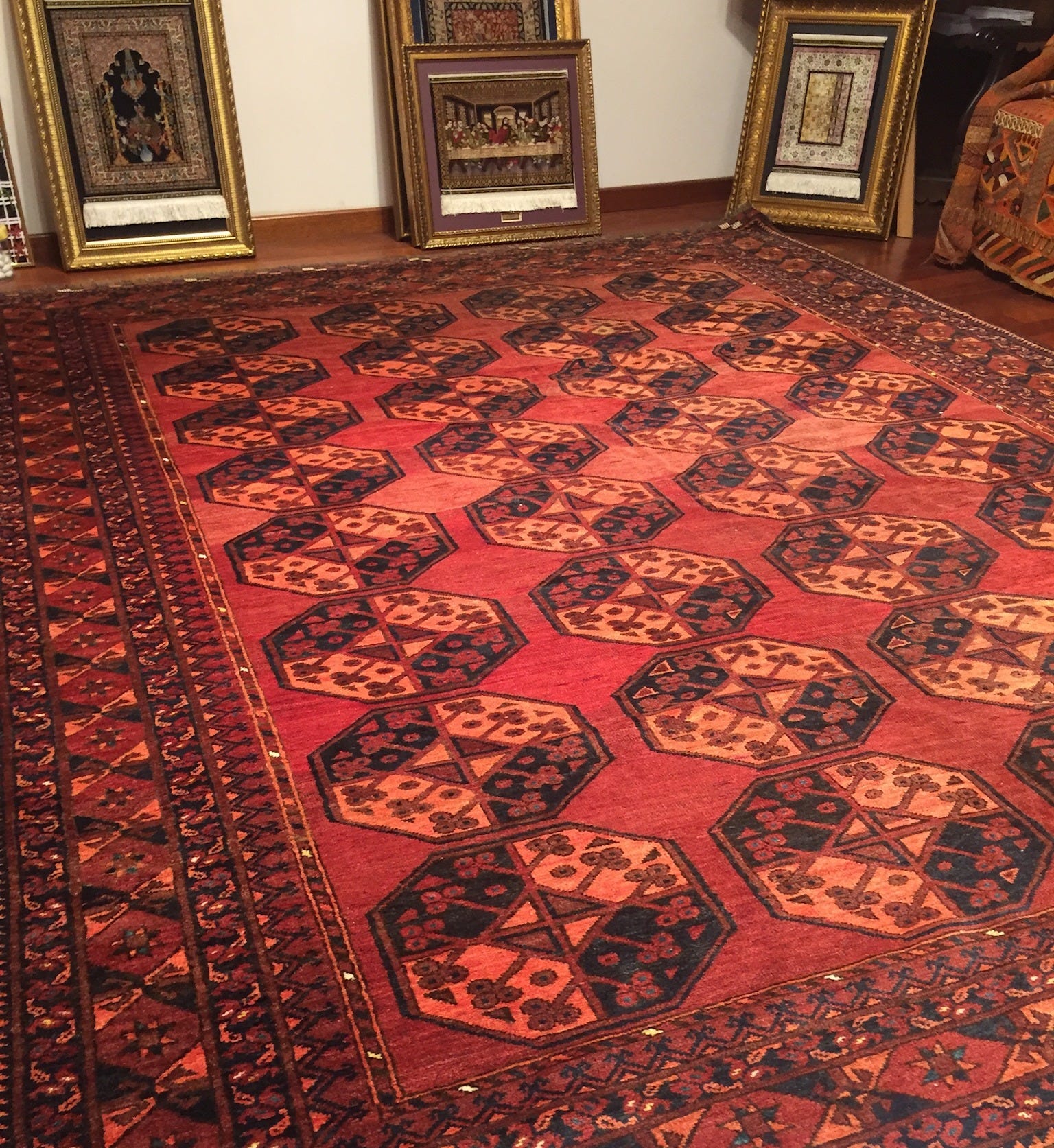
Travel sends me into what I lovingly call a black hole. Somewhere between Marrakech and Istanbul—and, more recently, Portugal—all restraint disappears. I come home with too much: Turkish rugs, Moroccan lanterns, Portuguese pottery, inlay tables, textiles I never planned for. Then I lay it all out on my own floors and try to make sense of it. I tell myself I’ll stop doing this. I never do.


What I’ve learned is that this kind of influence works best when it’s felt, not themed. It shows up quietly, in patina and texture, in objects that carry time with them. Even the colors begin to trace the map: rich terracottas, curry yellows, inky blues—tones that feel sun-baked, a little dusty, and strangely familiar.
That global layer will live on at Kemble Cottage, too. I’m imagining a den that leans fully into a nomadic, bohemian spirit: hyper-textiled walls with a sofa upholstered to match, ikats layered in warm, enveloping hues, framed textiles and artifacts, even a few pre-Columbian pieces I happen to have inherited. The goal isn’t drama for drama’s sake—it’s a space that feels collected, generous, and deeply traveled.
Of course, all of these influences eventually have to be married into a cohesive whole. That’s the work—and honestly, that’s the part I trust. I’ve never been interested in holding onto a trend. Design doesn’t live in one moment or one place. It’s shaped by the past, made relevant for the present, and constantly in motion. It moves. It travels.
When I step back, that’s really the through line of this house, and of my work more broadly. Nothing is meant to feel literal or precious. It’s about layering influences until they feel inevitable rather than forced. Everything else—the rooms, the finishes, the details—is simply how the story gets told.